Launched in 2019 by actor and comedian Seth Rogen, Houseplant has established itself as something of a trailblazer brand. Apart from being a distributor of Cannabis products (where legalised in the US, with no intention to encourage use where prohibited), they also sell a variety of mid-century home accessories that, whether you're a smoker or not, are undeniably "cool". Whether it's a marble oil lamp/ashtray or a handcrafted ceramic vase designed by Seth himself, the products ooze vintage sophistication.
However, It's not just the product line that caught our attention. Their 60s and 70s inspired ads are the perfect accompaniment to the product's design.
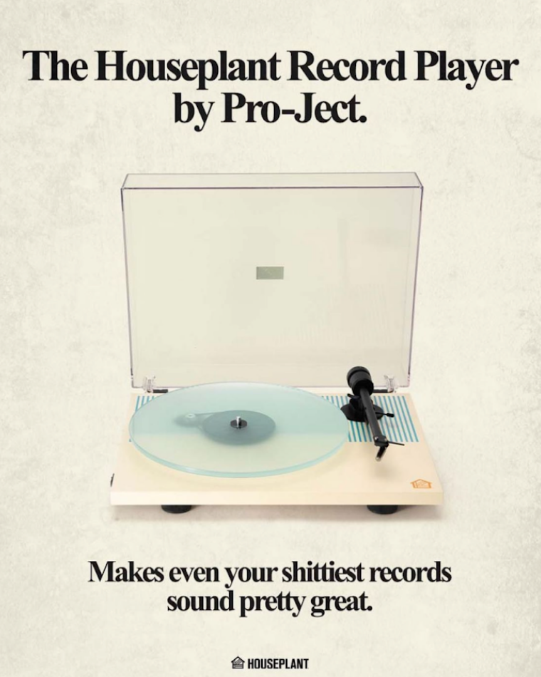
In one example, Houseplant has revived period-esque newspaper and magazine print ads. Think grainy textures, brown and beige tones and a good use of negative space. We've seen the same trends in fashion and architecture, with brands like Kim Kardashian's shapewear brand Skims also adopting the vintage style:
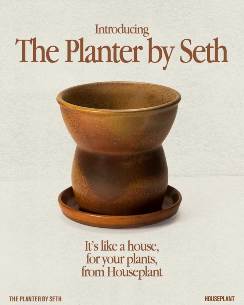
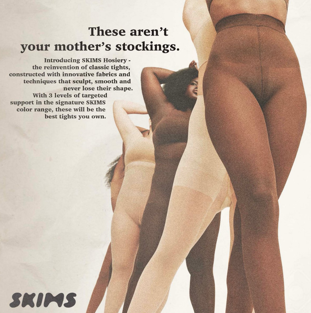
Both examples use playful copy that lends itself to the notion that consumers respond well to brand authenticity, as though it's being described by a friend or older sibling. The warm colour scheme draws attention to the product and is a softer way of communicating its benefits without feeling too in your face or 'salesy'.
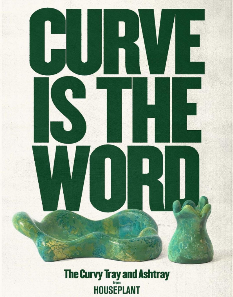
A common characteristic of this style is using either a monotone or duotone palette. For example, you can select a colour a few shades darker than your product to use in all other graphic elements (as seen in the dark green fonts used on the left). Alternatively, try eye-dropping from a less stand-out element of your focal image (as shown from the record needle of the right image) to make the mix of colours feel more cohesive. Both show how you can still be impactful, whilst remaining minimalist.
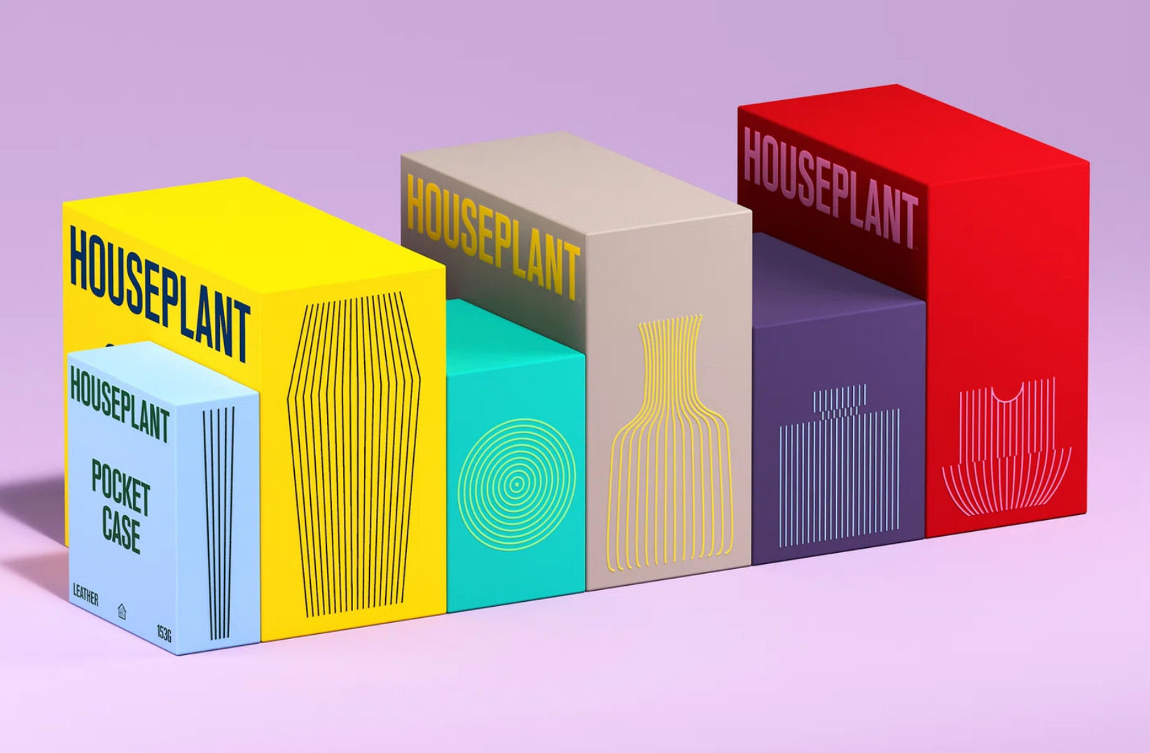
What's important is that the product remains useful beyond its original purpose. When the only differentiator between two bottles of gin is that one will look nicer on the mantelpiece, it can really make an impact. It's important to consider how your products' branding works together to tell a coherent story about your brand.
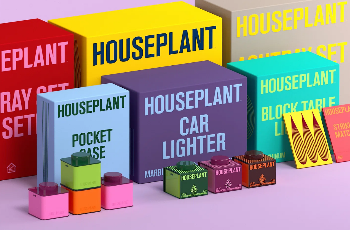
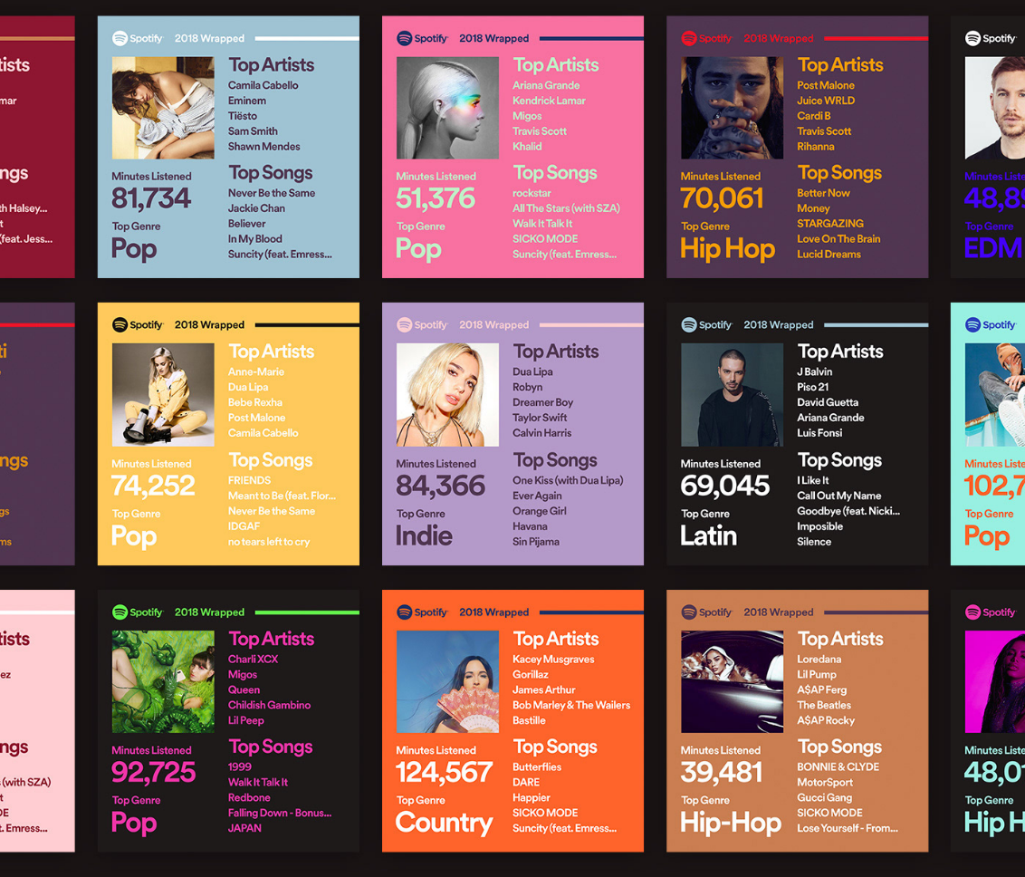
The colour usage is eccentric and combines tones and shades which, at first glance, may appear uncomplementary but in the context are extremely flattering. This is because it uses a combination of soft bright pastels e.g. yellows, pinks and blues, alongside cooler shades e.g mauve, beige and dark blues. Spotify really championed this colour theme in 2018 and it's been a staple for them ever since:
– Be bold with colour and design. Play with combinations you haven't considered and look to the past for inspiration. We recommend exploring https://coolors.co/
– Be authentic. Build on how you'd describe your product to a friend, before giving the voice to the brand
– Think about longevity. Consider how your brand extends beyond your product – what's the unique proposition that keeps them coming back to your feed or product?
Grace Robertson, Senior Performance Manager, In Studio
Ready to improve your performance?
Reach out to one of our team to learn more about our services and how we can help your business thrive.
Talk to us